Blogs, Insights
Farrer Kane & Co The evolution of a visual identity
We recently announced our new name and revealed our refreshed visual identity and website.
The transformation is just one of the ways we are marking the agency’s 10th anniversary – coming up fast in summer this year.
Our decision to change our name from Farrer Kane to Farrer Kane & Co reflects our growth as a business, and the contribution the whole team makes to our success. The new name is more an evolution than a revolution. This is because the heart of the agency, what’s important to us and the way we approach supporting our clients is exactly the same as it has always been, all that’s changed is the scale of our business.
For us then – in common with many brands refreshing a logo and wider visual identity – it was important to retain a tangible throughline from who we were on the day we opened our doors – to who we are today. To honour what has stayed the same as well as what is different.
Here’s our designer, Mark Palmer, to give a peek behind the scenes as to how we went about it…
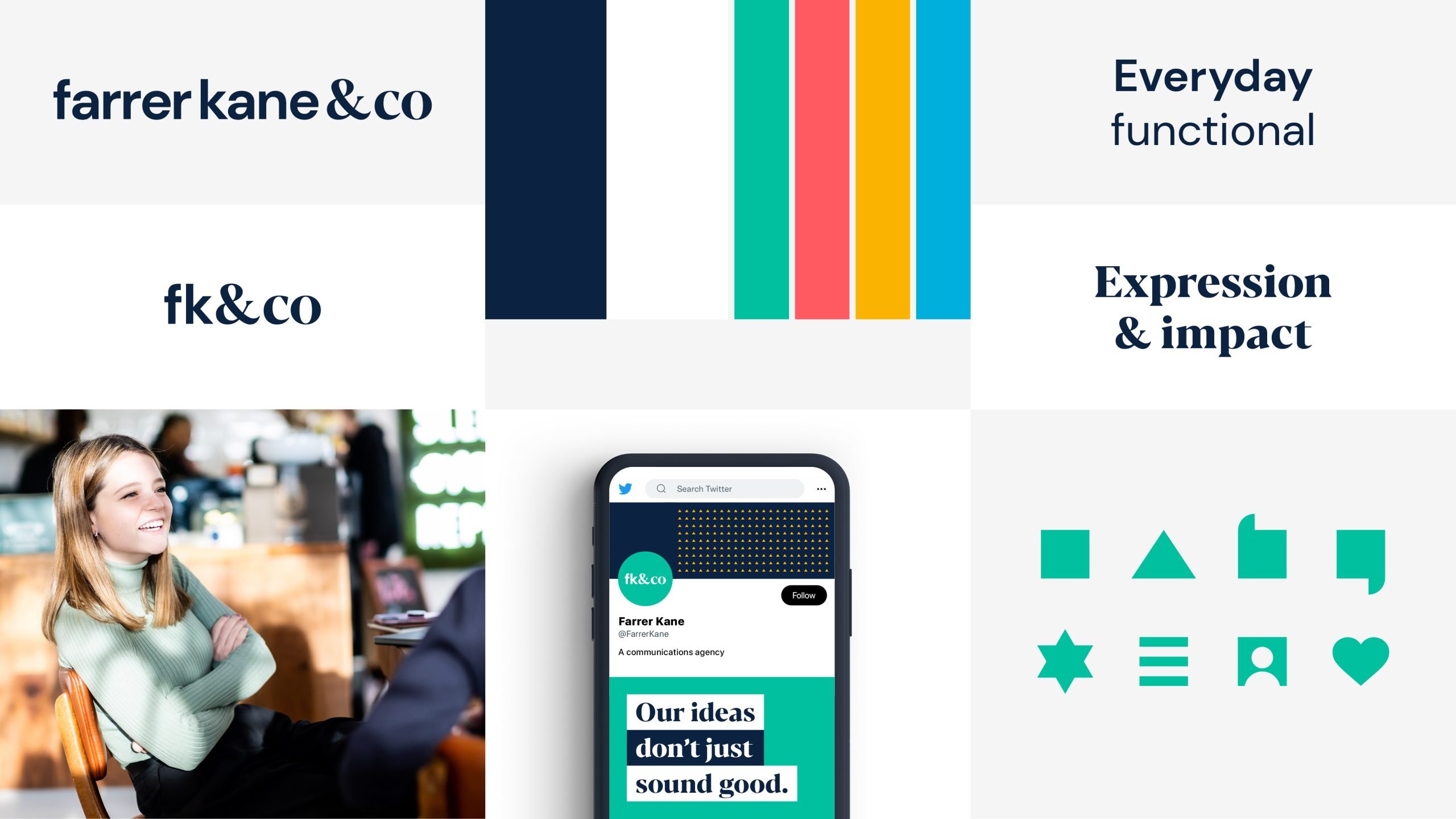
A visual identity is a kit of parts made up of many elements that work together to create a unique and recognisable brand. In the case of our identity, this includes: our logo, colour palette, and typography as well as iconography, photography and animation. We have updated and evolved each of these elements to reflect who Farrer Kane & Co are today.
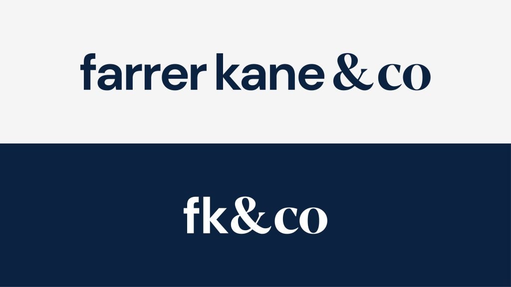
Our new logo is in no way a radical overhaul, it’s an understated update designed to represent two distinct aspects of the agency. The Farrer Kane element builds subtly on our original logo – functional and contemporary, it says: as ever, you can still rely on us to offer straight-talking advice and clever execution. The & Co element conveys that we’re bigger and in a contrasting font, it’s a nod to our more creative and expressive side, our growing diversity.
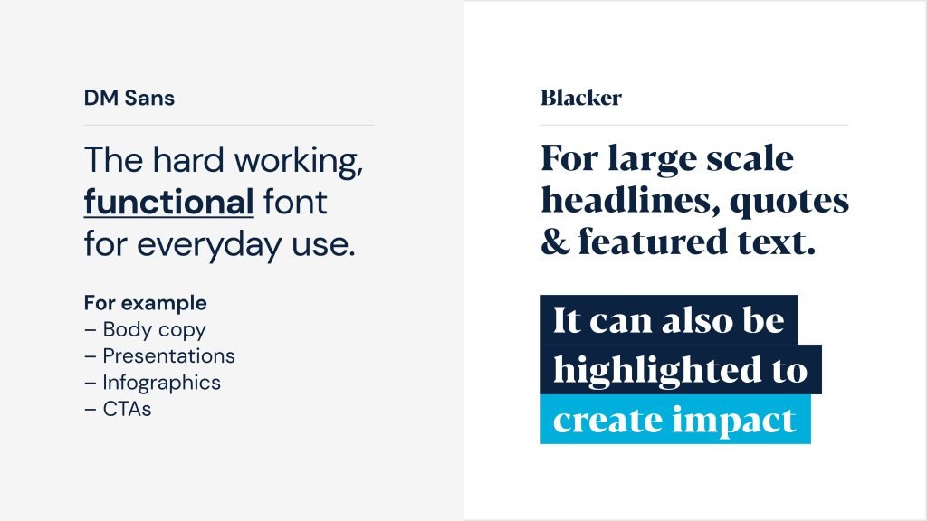
This thread runs through to the fonts we have chosen as part of the identity refresh. As fanatical devotees of Helvetica, the 1957 font lauded for its simplicity and elegance, moving on was always going to be a wrench. DM Sans does the same job as Helvetica, but being designed for screens, it has the advantage of being able to do it in a more contemporary way. It’s versatile and easy to read, so it’s the perfect choice for every day use. We have also added Blacker, a contemporary serif font to our tool kit. Being a more expressive font than DM Sans, Blacker gives us the flexibility to dial up the impact when we need it: to emphasise details, highlight what is important and set headlines.
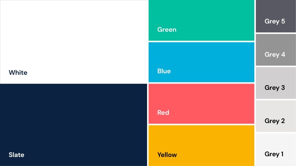
We have always used colour intentionally, originally within a narrow range of black, white and green. With our refresh we’ve opened up our palette to a wider variety. Slate replaces black, to be used alongside white to make up our core colours. These two colours do the ‘heavy lifting’ to colour our logo and text. Now we’ve added a bright range of ‘extroverts’ to work with ‘Farrer Kane green’. These are the expressive colours we use when we need to make an impact. We’ll also draw on a palette of grey shades for more functional purposes: backgrounds, shapes and for definition in lines, charts and graphs. We have thought carefully about how we will use colour with purpose to communicate clearly, and direct reader and viewer attention where it’s needed.
The square icon that was a feature of our logo lives on in our use of icons. A wider set of icons have been created, with each being drawn using the simple square shape as a starting point. In their most basic form, these icons play a functional role. An example of this is using them as buttons within the navigation of our new website. We also use them in a playful way, bringing the icons to life in dynamic animations or using them to create texture through patterns.

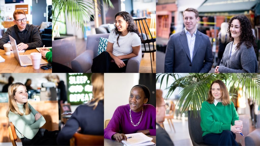
We’ve approached photography differently to make sure the way we present our team aligns with the new identity. We’ve chosen a candid, reportage style which reveals the people behind the work we do, and all the expressive and diverse personalities we’re pleased to count among our team.